Picking colors for a website or GUI can be difficult. However, for blind, colorblind, and creatively challenged people, choosing colors can be nearly impossible. Most people will resort to using vague descriptions, like “Blue is a cool color”, or “Use green to describe liveliness and nature!”.
The fact is, they’re not wrong. But this method of choosing colors is not effective for people who physically cannot see color, or for people who severely lack creativity or artistic ability. For these people, we need a new method; one that can scientifically and objectively determine color combinations that might be visually appealing.
In this article, I will be using pictures. I realize the irony of using pictures when the target audience for this blog post will be people who are unable to see or effectively understand color. However, I still want to make sure this post is inclusive of non-colorblind people who are looking for a scientific way to choose colors.
In one go, we’ll be covering both of these scenarios at once :
- You already have some sort of photo or theme that you are basing the rest of the color scheme around.
- .You don’t have any material, meaning you have a white slate. You haven’t chosen a color scheme, and you need help choosing a color.
If You Already Have A Photo or Theme
If you already have a photo, then the first step is to figure out what the dominant color is. This should be fairly simple, but if your photo has multiple varying colors, then you will need to use the average color of the photo.
The average color of the photo is defined by this simple algorithm :
totalRed = 0
totalGreen = 0
totalBlue = 0
numPixels = 0
for every pixel in the image
    totalRed += red in pixel
    totalGreen += green in pixel
    totalBlue += blue in pixel
    numPixels += 1
averageColor = [totalRed / numPixels,
                totalGreen / numPixels,
                totalBlue / numPixels]
Now that you have the average color, we will be basing our entire color scheme around saturation variances of that color.
For example, let’s take a look at cover of my machine learning book, The Mostly Mathless Guide To TensorFlow.

If you get the average color of this book cover, you’ll find that the average color is a gray-ish blue.

Although, in this cover, you can easily tell that the dominant color is blue. When you are easily able to determine the dominant color by a quick glance, there is no need to compute the average color of a photo. However, if you cannot see color, or if the dominant color cannot be easily determined, then an average color algorithm can be very helpful.
The only caveat is that you cannot use the average color if your photo or theme is rainbow or has too many varying colors. For example, here is a rainbow photo.

And if we look at the average color, we will get a color like this :

In general, if you mix together all of the colors, you will get a murky brown. So it’s no surprise that getting the average color of a rainbow photo will give you an ugly brown-red-ish color.
But What If I Don’t Have a Photo?
If you don’t have a photo, don’t worry! You can determine an ideal color by using the following guidelines from one of Cornell’s art classes, which you can find here.
In general, colors can have both a positive and a negative effect. The most obvious one is red.
Red is often used to evoke feelings of power, strength, energy, and vitality. However, red can also symbolize anger, blood, and violence. Usually red is too aggressive of a color to use as a dominant color, and if it is used as a dominant color, it should be paired with copious amounts of white. Red is often a very good color to use, provided you don’t over-use it.
Blue represents calmness, tranquility, elegance, coolness, and knowledge. On the flip side, it could also represent depression and sadness. Blue is a very safe color to use in your color scheme. In fact, if you are developing software, blue is an excellent color to choose because it disrupts the sleep cycle of the user, causing them to use your product for longer periods of time without getting tired (according to Scientific American).
Yellow is upbeat, cheerful, and optimistic. It’s extremely bright, and will catch anyone’s eye. The downside is that if you use too much yellow, your customers will be annoyed because yellow has very high contrast. Other than that, there are basically no downsides to yellow, and no other wrong ways to misinterpret yellow.
Red, blue, and yellow are the ideal colors, and the remaining colors are mostly niche colors. A study of the top 100 company logos shows that 38% of them have red, 37% have blue, 24% have yellow, and the rest are either black, white, or have negligible amounts of the other colors.
Green represents life, vitality, growth, and money. Especially money, since the dollar bill and dollar sign are green. Green is also associated with toxicity, but realistically, green is a very hard color to misinterpret. Aside from companies that are focused on finance, agriculture, or the environment, there is n’t too much incentive to use green.
The remaining colors are extraordinarily niche.
Pink is for companies that want to focus on women, especially for cosmetics or clothes. Other than that, don’t use pink.
Purple is for games, fantasy, royalty, and dreaming/sleeping. It’s a very niche and rare color, although Yahoo! and Twitch both use purple for their color schemes.
Orange is a friendly color, and suggests accessibility and openness. Use orange when your company is related to oranges, for obvious reasons. However, the negative side is that orange can be associated with ordinariness and being over-accessible.
In general, if you’re unsure of which color to pick, you really can’t go wrong with one of red, blue, or yellow.
White and Black
Before we dive into discussing about colors that compliment and match each other, we first need to talk about white and black. Use white and black generously with any color you choose.
In general, prefer white over black unless you are going for a night/dark theme. White will go with any color you choose, except yellow. White and yellow is a nightmare color scheme. When using yellow, you must have contrast, otherwise the yellow will blend in with the white, making your website or logo hard to read.
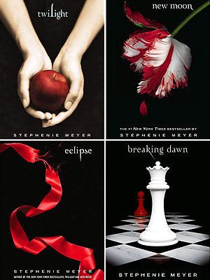
The other forbidden combination is red with black as the dominant color. There are very few scenarios that red and black will look good in. Unless you are specifically going for a gothic, dark, vampiric, scary, or satanic theme, I strongly advise against choosing red and black. This is why all four books of the Twilight vampire series are in black and red.
Tints and Shades
Let’s first talk about tints and shades of a color. This is the easiest way to guarantee that you won’t mess up a color combination — by using the exact same color, but changing its saturation or lightness. It gives a very comfortable feel, and is the easiest design to do. This is a principle that follows in line with material design.
Pick literally any color you want, and then use a (usually) darker version of it to add variety to your color scheme, although a lighter version is also acceptable.
Here are some examples :
Blue

Red

Yellow

Complementary Colors
Complementary colors are polar opposites of each other. You use complementary colors when you want to create extremely high contrast. On a web page, avoid using too many complementary colors together, or your users will feel uncomfortable due to the high contrast.
All algorithms can be found online. A complementary color is just two colors that, when combined together, form black or white.
Purple – Complement, Yellow

Green – Complement, Red

Blue – Complement, Orange

Analogous Colors
Analogous colors are colors that are next to each other on the color wheel. Analogous colors are very comfortable, and give a feeling of calmness and tranquility. They look beautiful when placed next to each other for this reason.
However, from experience, analogous colors work best when you use light variations of the colors, rather than dark variations. When going for a calm feeling, dark colors give too much expression and contrast, which is generally the opposite of what you want.
To generate a complementary color, simply pick a color, and then the two colors next to it on the color wheel.
Light Red-Orange – Analogous Colors are Light Orange and Pink-Red

Light Green – Analogous Colors Are Green-Teal and Green-Yellow

Lavender (Blue) – Analogous Colors Are Royal Purple and Bright Teal

Bright Yellow – Analogous Colors Are Green-Yellow and Orange

In general, analogous colors are harmonious, as you can (or maybe can’t) see.
Split Complementary Colors
If you want to use complementary colors, but you feel that the contrast is too strong, use split complementary colors instead. A split complementary color is formed when you take a color and find its complement. Then, instead of choosing the complementary color, you take the two analogous colors for that complementary color instead.
This gives you a similar high-contrast effect as a complementary color, but it is harder to mess up because the colors will have significantly less contrast. On the color wheel, this will usually look like a very thin isosceles triangle.
Bright Yellow – Split Complementary Colors Are Hot Pink and Lavender

Green – Split Complementary Colors Are Red-Orange and Hot Pink

Royal Blue – Split Complementary Colors Are Mustard Yellow and Orange

Red – Split Complementary Colors Are Green and Blue

Triad Colors
Triad colors are what you would get if you took a color wheel and made an equilateral triangle. The colors are perfectly spaced from each other, which gives you a vibrant feel. Unfortunately, it does not give you a harmonious feel, so use one color dominantly, and the other two as supporting colors.
Use the other two colors sparingly for best effect, because these colors will generally be quite close to the split complementary colors. The only difference is that they are more spaced apart, which gives them less contrast.
Blue – Triadic Colors Are Yellow and Red

Green – Triadic Colors Are Orange and Purple

Since triadic colors are equidistantly spaced, there are essentially only two examples. If you pick yellow as your dominant colors, you will get blue and red. If you choose red as the dominant color, you will get yellow and blue.
Tetradic Colors
You get tetradic colors when you pick two colors next to each other on the color wheel, and then pick the two complementary colors of those two colors. You will end up with a rectangle. The effect is that you get high-contrast, but with a variety in colors, as you now have four colors instead of two.
Because of the high contrast, you should generally pick one or two colors (assuming the two colors are NOT complementary colors) and using the other two colors sparingly.
Having a tetradic color scheme is significantly harder and more complex than the other color schemes. As a result, you may find it difficult to get a decent ratio for each color, causing either an ugly or overly high-contrast design.
Purple (Tetradic Colors Are Yellow, Green, and Red)

Red (Tetradic Colors Are Green, Blue, and Orange)

Orange (Tetradic Colors Are Blue, Purple, and Yellow)

Conclusion
We’ve gone over many different color schemes, and the one that works best for you may vary. In general, the easiest color scheme will be analogous colors, split complementary colors, or easiest of all, using tints and shades of a specific color. That’s not to say that the other color palettes are bad — rather, they are exceptionally useful. However, if you are an absolute beginner at picking colors, go for one of the three choices listed above.
If you need something more flexible, the other color palettes are there for you. As with anything involving creativity, the best way to discover what works and what doesn’t is to try it out. Blindly choosing random colors is a poor way to design graphics, but with this approach, it is easy to create multiple designs and have other people critique them.
So what are you waiting for? Get out there and start playing around with your new-found color powers!
